Case Study
Homepage Conversion Growth
How a SaaS company doubled conversions by fixing clarity not traffic or design.

From High Traffic, Low Conversions → Consistent Lead Growth
Client: B2B SaaS (Project Management Tool)
Traffic: ~12,000 monthly visitors
The Situation
The company had built a steady acquisition engine.
Paid ads were bringing in consistent traffic. SEO was starting to show results. The product itself had strong feedback from existing users.
But conversions were stuck at 0.9%.
They were generating interest, but not enough qualified leads to scale revenue confidently. Increasing ad spend didn’t make sense because the returns weren’t there.
The team kept trying small fixes changing headlines, testing button colors, adjusting targeting, but nothing created a meaningful shift.
What Was Going Wrong
The issue wasn’t visibility.
It was clarity.
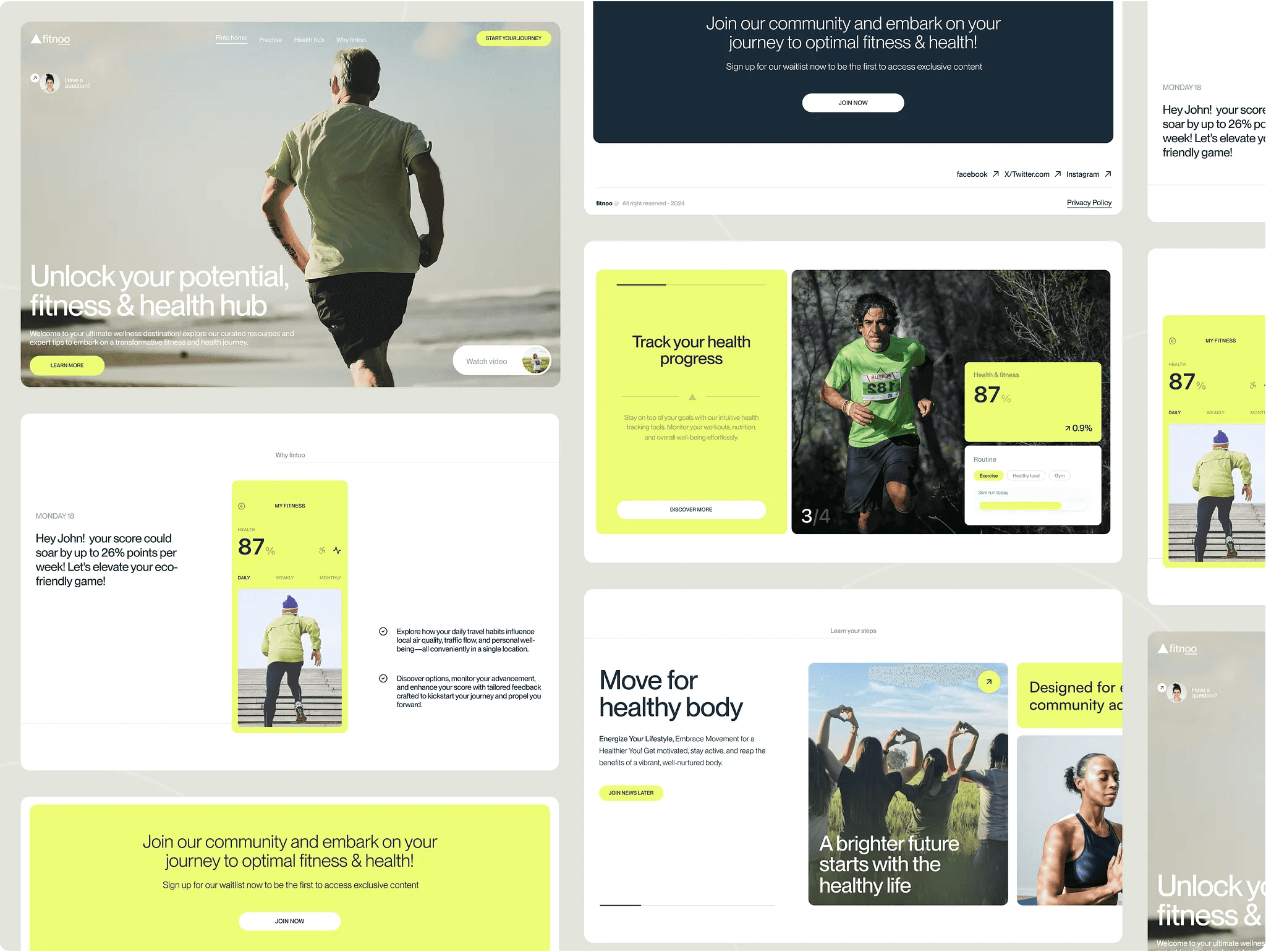
The homepage didn’t clearly explain who the product was for
Messaging focused on features instead of outcomes
Multiple CTAs created confusion
There was no clear flow guiding the user forward
Users landed on the page, skimmed, and left without fully understanding the value.
What We Changed
Instead of redesigning everything, the focus was on simplifying and structuring the message.
Rewrote the hero section to clearly state the outcome and audience
Reduced CTAs to one primary action with minimal distractions
Structured the page as a step-by-step narrative
Replaced generic claims with simple, relevant proof
The goal was straightforward: make it easy to understand and easy to act.
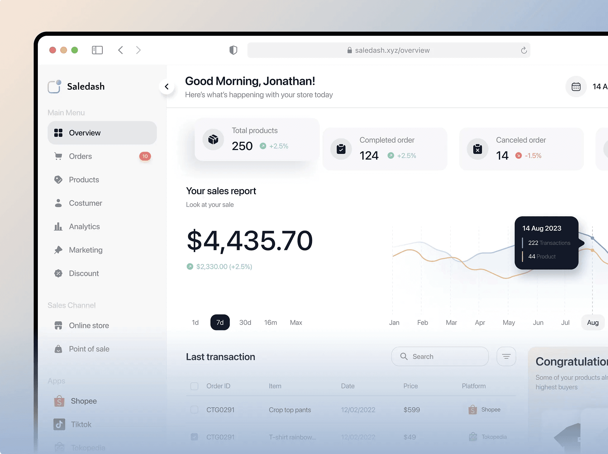
The Results (30–45 Days)
Conversion rate: 0.9% → 1.8%
Demo requests: +65%
Bounce rate: ↓ 18%
Cost per lead: ↓ ~22%
Key Takeaway
Growth didn’t come from more traffic or more features.
It came from removing confusion.
When users understand what you do and why it matters within seconds, they’re far more likely to take the next step.